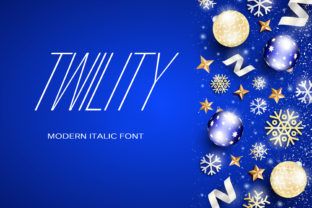
Twility: A Display Font That Commands Attention—Without Compromising Clarity
Twility isn’t just another bold font—it’s a thoughtfully crafted display typeface designed to anchor headlines, logos, and short-form visual messaging with confidence and distinction. Its strong geometric structure, balanced proportions, and subtle humanist touches give it presence without stiffness. Whether you’re launching a brand identity, designing a social media campaign, or refreshing course materials for students, Twility helps your message land—not because it shouts, but because it speaks with intention.
Why Designers and Communicators Reach for Twility
People choose Twility when they need more than decoration—they need resonance. It works exceptionally well in contexts where legibility at scale matters: hero banners, podcast cover art, presentation slides, packaging mockups, and even engraved signage. Unlike many ultra-bold display fonts that sacrifice rhythm for weight, Twility maintains consistent stroke contrast and open counters, making it surprisingly readable even in tight spaces or on lower-resolution screens.
Its uniqueness is intentional—not gimmicky. You won’t confuse Twility with common system fonts like Helvetica Bold or Montserrat Black, nor will it blend into the background of crowded digital feeds. That distinctiveness is why educators use it for workshop titles, freelancers apply it to portfolio headers, and small businesses adopt it for storefront signage: it signals care, clarity, and consistency.
Common Missteps—and What They Cost You
Despite its strengths, Twility is often misapplied—not because it’s flawed, but because expectations around display fonts don’t always match reality. Here’s what trips people up:
- Using it for body text: Twility was never built for paragraphs. Its high x-height and tight letterfit make extended reading tiring and inefficient. One freelance designer learned this the hard way when a client requested Twility across an entire landing page—only to see bounce rates climb 37% during usability testing. The fix? Pair Twility with a neutral, highly legible sans-serif (like Inter or Lato) for body copy.
- Assuming it’s free or open-source: Twility is a commercial font. Downloading unofficial versions from sketchy sites risks broken files, missing weights (like Light or Italic), or even embedded malware. Worse, unlicensed use exposes creators to legal risk—especially if used in client work or public-facing branding. Always verify licensing through the official foundry or trusted platforms like Creative Market or MyFonts.
- Overlooking context-specific rendering: Twility looks stunning in print or high-DPI web exports—but may appear slightly heavier or less crisp on older Android devices or legacy email clients. A marketer once launched a newsletter using Twility for all headings, only to find key CTAs nearly illegible on Outlook desktop. Testing across real devices—not just previews—is essential.
- Ignoring optical sizing needs: Some users assume one Twility file fits all sizes. But display fonts perform best when matched to their intended scale. A version optimized for 48pt+ headlines may lack the fine-tuning needed for 24pt subheads. Check whether your license includes multiple optical variants—or whether a single “Display” cut suffices for your use case.
What to Verify Before You Commit
Before downloading, purchasing, or embedding Twility, pause and confirm these practical details:
- Licensing scope: Does your plan cover web use (with proper @font-face setup), desktop apps, mobile apps, or merchandise? Some licenses limit pageviews or installations—important for agencies managing multiple clients.
- Weight and style availability: Twility typically ships with Regular, Bold, and sometimes ExtraBold. If you need true Italics or a Light variant for hierarchy, confirm they exist—and that they’re stylistically harmonious, not algorithmically slanted.
- File format compatibility: Ensure you receive WOFF2 (for modern web), OTF (for design apps), and optionally WOFF (for broader browser support). Avoid TTF-only bundles unless you’re certain of your deployment environment.
- Technical documentation: Reputable vendors provide clear usage guidelines—including CSS snippets, fallback recommendations, and known rendering notes. If those are missing, reach out before buying.
Better Practices for Real-World Use
Twility shines brightest when treated as a strategic tool—not just a stylistic flourish. Here’s how seasoned users get the most from it:
Start with purpose, not aesthetics. Ask: “What action should this text prompt?” A workshop title in Twility might aim to inspire curiosity—so pair it with warm, accessible body text and generous spacing. A tech startup logo using Twility should reflect precision—so align it with clean layouts and restrained color palettes.
Respect hierarchy. Twility works best when it’s clearly the top layer of your typographic system. Don’t compete with it: avoid stacking multiple bold fonts or adding heavy shadows or gradients that muddy its shape. Let its structure breathe with intentional whitespace.
Test early, test often. Load Twility into your actual project environment—not just Figma or Photoshop previews. Try it in dark mode, on a tablet, inside a PDF export, and in your CMS editor. Small inconsistencies (like uneven baseline alignment or kerning gaps between “A” and “V”) become obvious only in context.
Consider accessibility by design. While Twility itself meets contrast standards at recommended sizes, ensure surrounding elements do too. For example, pairing Twility Bold with light gray body text fails WCAG contrast requirements—even if the headline alone passes. Always validate full combinations, not isolated elements.
A Final Note on Fit Over Flash
Twility stands out because it balances strength with subtlety—unlike fonts that rely solely on novelty or exaggeration. That makes it especially valuable for professionals who need credibility *and* creativity: educators building trust with learners, entrepreneurs communicating vision without jargon, or bloggers distinguishing their voice in saturated feeds.
The strongest designs don’t just look good—they function well, scale gracefully, and respect the people using them. Twility supports that goal—if you treat it with the same intentionality it was designed with. Choose it for moments that matter. Support it with smart pairing, careful licensing, and real-world testing. And above all—let it lead, not overwhelm.